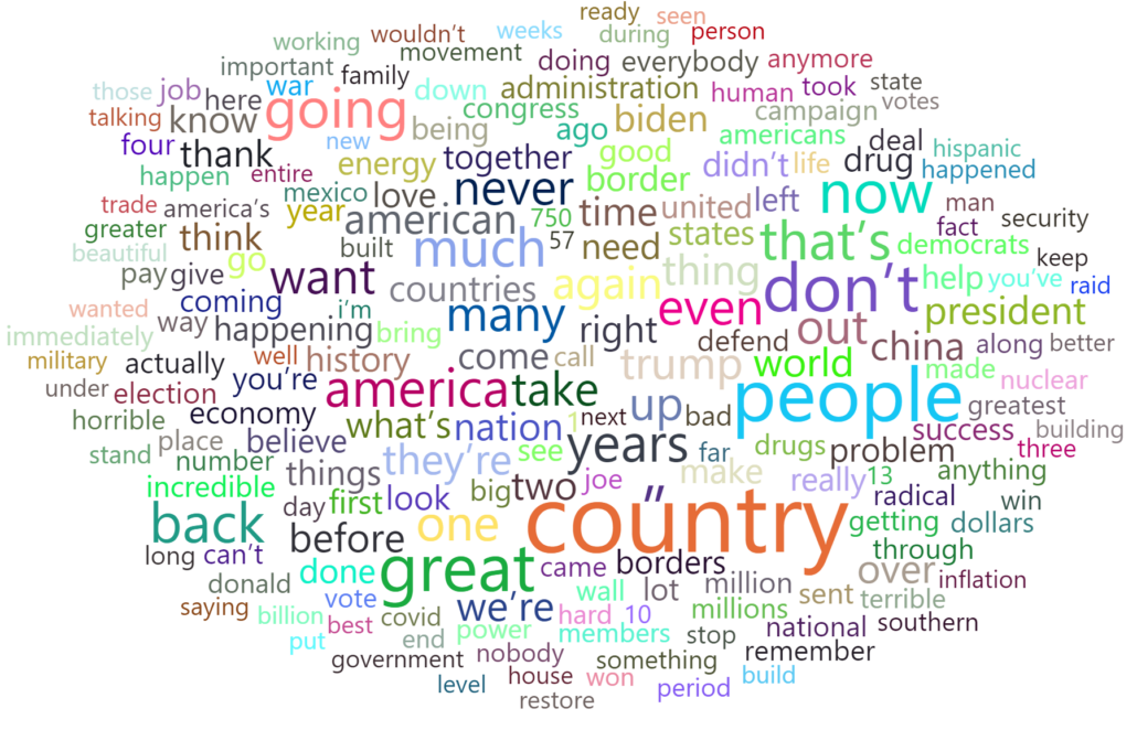
All right, let’s analyze Donald trump’s 2024 presidential election speech. And together, we will see the key and bold points. Well, we’ve got Mr. trump’s speech transcript in a text file. The chart that I’ve chosen is a word cloud chart.
But what is a word cloud chart?
Word Cloud is a visualization that draws an image from frequently appearing words in the data set. These words are arranged in a cloud shape. The size of the words in the cloud image is proportional to its frequency.
As always, we run power bi, select text/csv in the get data part and then select your text.
As you can see , the data has been divided into a few columns, and we need to take some steps to clean the information in this file.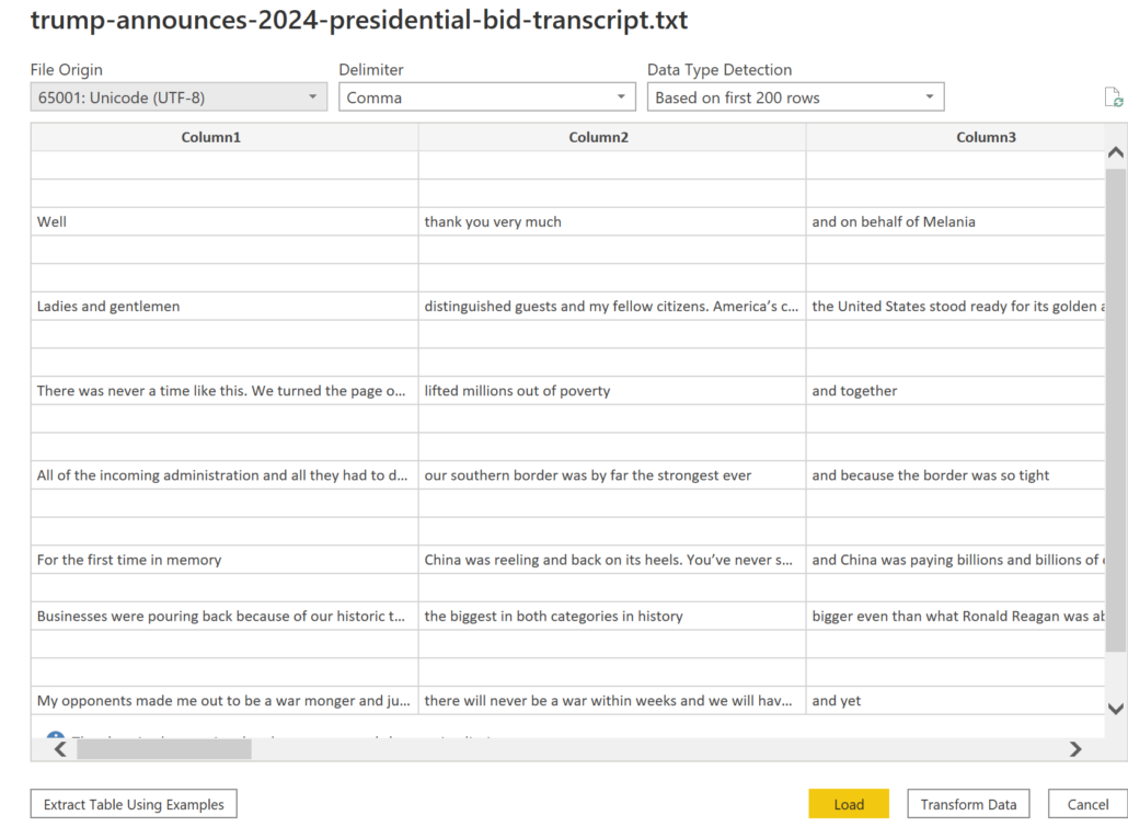
Basically, if we want to use a word cloud chart, we must first change the columns into words, and most importantly count the number of times the words have been repeated .of course not by hand.
Now it’s time to transform data.
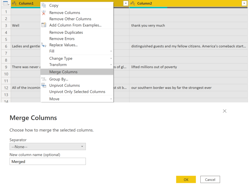
In the first step, we select all of the columns and merge them, a window will pop up asking if you would like to have a separator between the columns or if you would like to name the column. Ignore the pop-up window and continue without those changes.
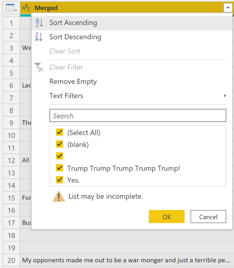
in the second step we ,filter irrelevant data such as the blank spaces.
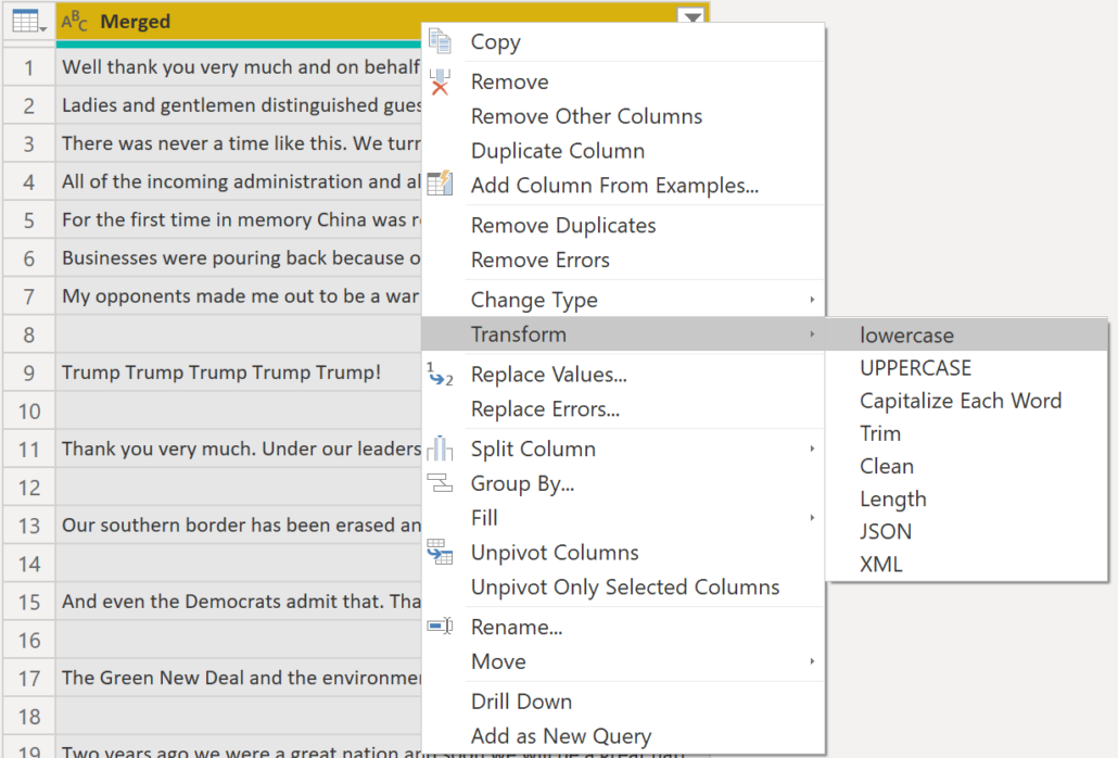
The third step is to transform all of the text into lowercase. To do this, right-click
on the top of the column, go to transform, and select lowercase.
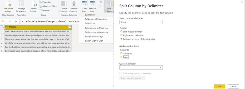
Now it’s time to break down sentences into words, to do so, we must go to the home tab then split columns, and then select by the delimiter.
In this window, we must set the delimiter based on space,
And in the advanced options, select rows instead of columns.
And in the advanced options, make sure you have selected rows and not columns.
And now press ok.
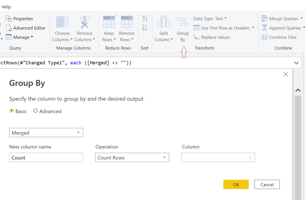
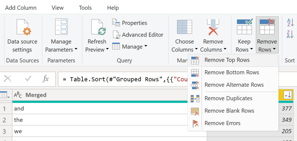
It’s time to count the words, to do this, go to group by in the home tab and then select count rows in the operation box.
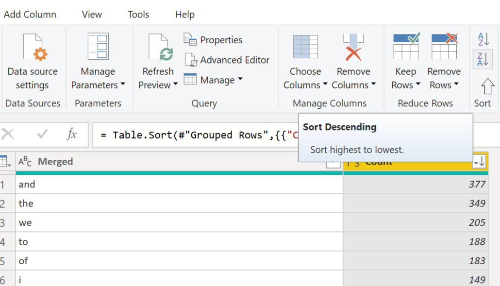
 Sort your data in descending manner.
An estimate of 30 top rows are useless, therefore, we need to get rid of them. To do this go to remove rows on your home tab, select remove top rows, and type in 30 in the number of rows box.
Of course, this is not a very precise or accurate process, And In the future, I will add a file with words that must be excluded.
And finally, press close & apply.
The word cloud chart is not a standard power bi chart.But we can add it in the visual part.
Add the word cloud chart from the get more visual part.
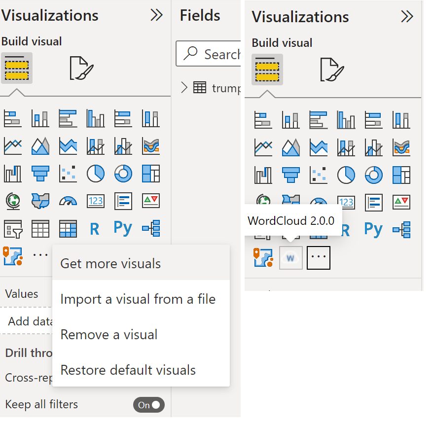
Now we have the chart on the screen.
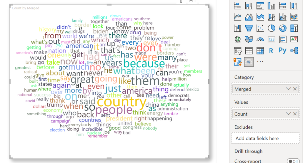
In the add data part of our word cloud chart, we need to insert the words in the category field and the number of times the words have repeated in the values field.
There are some words that have been repeated many times and we want to exclude them to not see them in our chart for example the words them, because, you, and so on.
But how do we do this? we can create a text file with those words and add it to the exclude box.
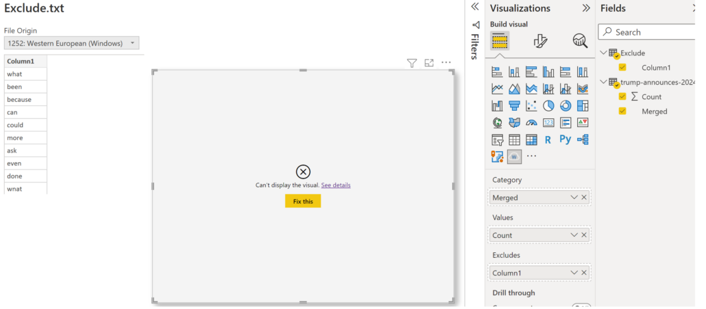
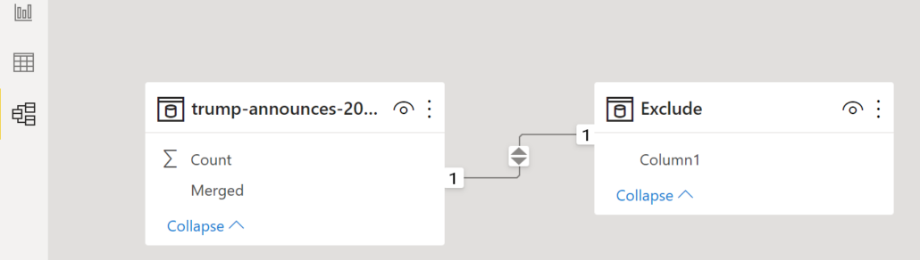
An error? but why ? in power BI, you can never create a chart with two or more tables that do not have a relationship with each other.
as you know, the words in the exclude file are in the merged column but they don’t have a relationship yet.
We can relate them from the model tab on the left side of your
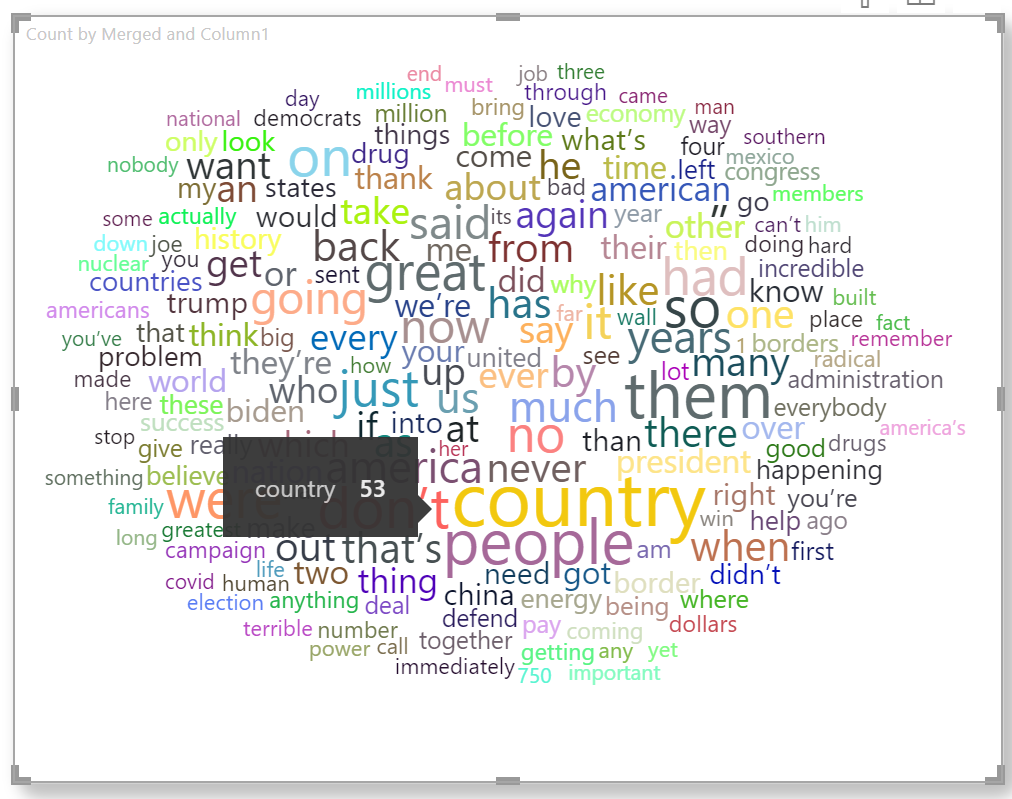
We can see that the word “country” is Donald trump’s most common used word, it has been used 53 times.
We can change the format of text in the format tab. You can deactivate the rotate text options.
I think this is a good example of data cleansing.

I have been working as a senior Business Intelligence Developer such as (Microsoft BI Services, QlikView, Qlik sense, and Power BI) since 2007, what’s more, I have been teaching BI courses such as (QlikView, Qlik Sense, Power BI, and SSRS) for 8 Years.
I want to address that I have been a consultant in various companies such as (Pharmaceutical corporates, port and maritime, insurance companies etc.).
I am capable of covering tasks such as (data cleansing, Designing dashboards, and KPI identification, and also I am well experienced in mentioned fields.
I have studied software engineering for 4 years bachelor’s degree In addition , I have published two books about business intelligence (QlikView with business intelligence approach, organizational key performance indicator)
I have passed the MCT and MCSA courses and I have been qualified for them.

Leave a Reply
Want to join the discussion?Feel free to contribute!